Graphing guidelines
·
Try some
practice worksheets
One of the most common
things students have problems with is making good graphs for their experimental
data. Fortunately, good ol' Mr. Guch has some suggestions that you can use to
get an A+ on every graph you do for a lab or class. I've included an example of
a good graph and a bad graph after the rules, so you know what these will look
like.
|
1. Always give your graph a title in the following form: "The dependence of (your dependent variable) on (your independent variable). Let's say that you're doing a graph where
you're studying the effect of temperature on the speed of a reaction. In this
reaction, you're changing the temperature to known values, so the temperature
is your independent variable. Because you don't know the speed of the
reaction and speed depends on the temperature, the speed of the reaction is
your dependent variable. As a result, the title of your graph will be
"The dependence of reaction rate on temperature",
or something like that. 2. The x-axis of a graph is always your independent variable and the y-axis is the dependent variable. For the graph described above, temperature
would be on the x-axis (the one on the bottom of the graph), and the reaction
rate would be on the y-axis (the one on the side of the graph) 3. Always label the x and y axes and give units. Putting numbers on the x and y-axes is
something that everybody always remembers to do (after all, how could you
graph without showing the numbers?). However, people frequently forget to put
a label on the axis that describes what those numbers are, and even more
frequently forget to say what those units are. For example, if you're going
to do a chart which uses temperature as the independent variable, you should
write the word "temperature (degrees Celsius)" on that axis so
people know what those numbers stand for. Otherwise, people won't know that
you're talking about temperature, and even if they do, they might think
you're talking about degrees Fahrenheit. 4. Always make a line graph Never, ever make a bar graph when doing
science stuff. Bar graphs are good for subjects where you're trying to break
down a topic (such as gross national product) into it's
parts. When you're doing graphs in science, line graphs are way more handy, because they tell you how one thing changes
under the influence of some other variable. 5. Never, EVER, connect the dots on your graph! Hey, if you're working with your little sister on one of those placemats at Denny's, you can connect the dots. When you're working in science, you never, ever connect the dots on a graph. Why? When you do an experiment, you always screw something up. Yeah, you. It's probably not a big mistake, and is frequently not something you have a lot of control over. However, when you do an experiment, many little things go wrong, and these little things add up. As a result, experimental data never makes a nice straight line. Instead, it makes a bunch of dots which kind of wiggle around a graph. This is normal, and will not affect your grade unless your teacher is a Nobel prize winner. However, you can't just pretend that your data is perfect, because it's not. Whenever you have the dots moving around a lot, we say that the data is noisy, because the thing you're looking for has a little bit of interference caused by normal experimental error. To show that you're a clever young
scientist, your best bet is to show that you KNOW your data is sometimes
lousy. You do this by making a line (or curve) which seems to follow the data
as well as possible, without actually connecting the dots. Doing this shows
the trend that the data suggests, without depending too much on the noise. As
long as your line (or curve) does a pretty good job of following the data,
you should be A-OK. 6. Make sure your data is graphed as large as possible in the space you've been given. Let's face it,
you don't like looking at little tiny graphs. Your teacher doesn't either. If
you make large graphs, you'll find it's easier to see what you're doing, and
your teacher will be lots happier. So, those are the steps you need to follow if you're going to make a good graph in your chemistry class. I've included a couple of examples of good and bad graphs below so you know what these things are supposed to look like. |
|
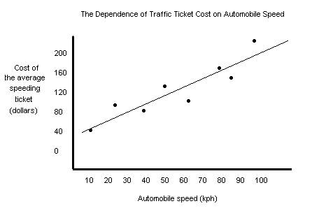
Examples of Good and Bad Graphs All those rules I gave you above are true and are handy to know, but it's usually a bad idea to give rules without showing you what they mean. Below are two examples of graphs. One is a bad graph (which you may be guilty of making) and the other is a good graph (which is what I always make). A bad graph!
Let's see what's wrong with this graph:
A good graph!
Doesn't the clarity and beauty of this graph just make you want to cry? Well, maybe that's overstating it a little bit, but it sure does make more sense than the first one, doesn't it? I'm starting to mist up right now.* *No, I'm not.
|
Questions? Comments? Tales of salsa gone bad? Email me at misterguch@chemfiesta.com

